Styling a Notice
Styles allow you to control the look and feel of your notices. Where notice templates are a template for the consent settings, styles are a template for the visual design. Privacy experiences that match the look and feel of the web experience have been proven to result in higher consent rates. Organizations often create a different style for each brand, division, or while running consent optimization tests.
|
To start creating a style, click Template & Assets and Styles in the main menu bar. From here you can modify an existing style or create a new one. |
❗Caution: If you edit an existing theme that is being used on active notices, changes will automatically be applied and visible on those notices. |
|
To begin the design process, click one of the display types from the tabs at the top: Link, Button, Banner, Barrier, and Options Dialog. You can design and preview the desktop and mobile experiences from each tab. |
Note: While you can design all display types within the style, you will select the display type to use on your notice during consent notice setup. The preview is a generic preview and text specific to a regulation might not match your final consent notice. |
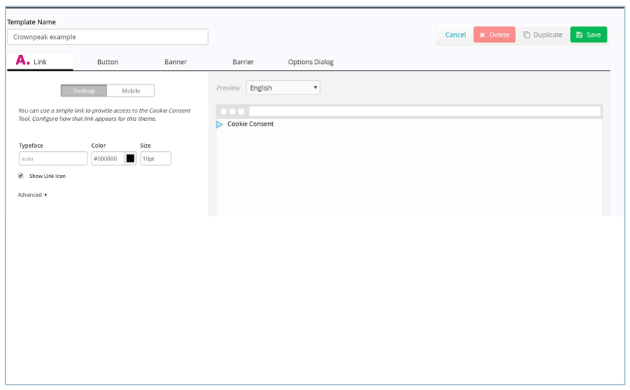
Link
A hyperlink your website visitors can click to access their privacy options. You can easily customize the typeface, color, or font size. Advanced customization is also available using CSS.
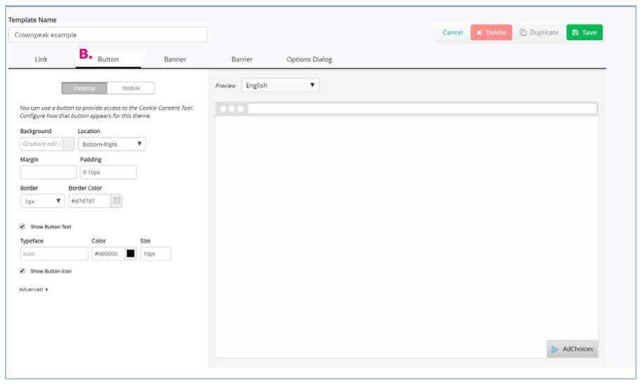
Button
A persistent button your website visitors can click to access their privacy options. You can easily customize the look and feel of the button, the text, and the location of the button. Advanced customization is also available using CSS.
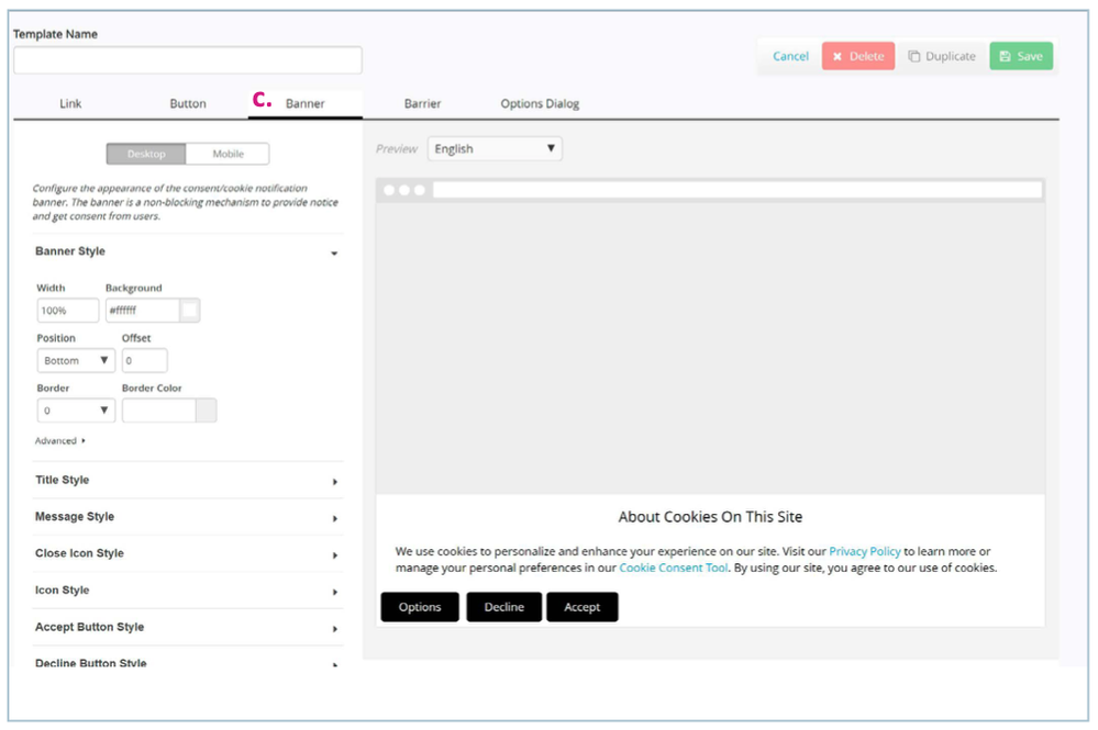
Banner
A banner is the most commonly used display type for consent notices. You can easily customize the look and feel of the banner, the buttons, the text, and the location of the banner. Advanced customization is also available for each element using CSS. The elements you can customize include:
- Banner Style
- Title Style
- Message Style
- Close Icon Style
- Icon Style
- Accept Button Style
- Decline Button Style
- Options button Style
- Page Overlay
- Collapsed Message Style (mobile-only)
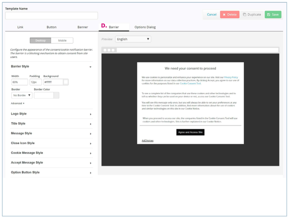
Barrier
A barrier blocks a website visitor’s access to a site until they have provided consent. You can easily customize the look and feel of the barrier, the buttons, the text, and the background overlay. Advanced customization is also available for each element using CSS. The elements you can customize include:
- Barrier Style
- Logo Style
- Title Style
- Message Style
- Close Icon Style
- Cookie Message Style
- Accept Message Style
- Option Button Style
- Accept Button Style
- Decline Button Style
- Background Overlay Style
Options Dialog
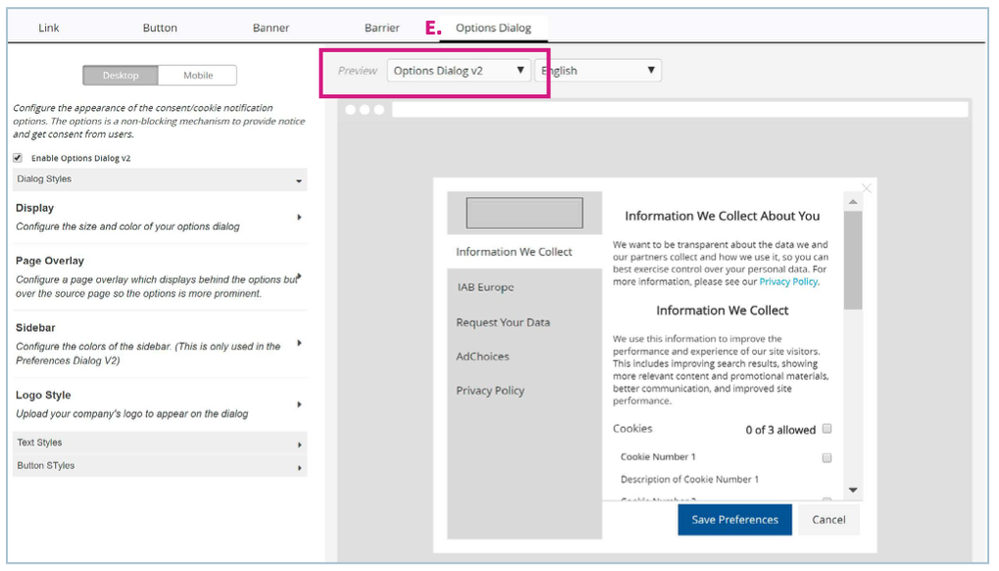
The Options Dialog is where website visitors can access additional privacy information and/or granular consent options. It includes multiple pages or tabs as part of the experience that can be viewed from the drop-down menu above the preview.
Using the Options Dialog v2 is highly recommended if you are trying to comply with the GDPR and CCPA. You can change your view to the Options Dialog v2 in the drop-down menu above the preview and enable using the checkbox in the left column.
The elements you can customize include:
- Enable Options Dialogue V2
- Display
- Page Overlay
- Sidebar
- Logo Style
- Text Styles
- Button Styles
Copying, Editing and Deleting a Style
You can duplicate, edit, or delete a style by clicking Templates & Assets and Styles from the main menu bar. Click on the style you would like to make changes to. Make edits or click Duplicate or Delete in the top right of the screen.

