Common Styling Changes For Options Dialog V2 Migration
As you move to the use of the Options Dialog V2 please keep in mind these changes that are most frequently made to the styling by customer’s who have already made the switch. This is not necessarily required for everyone, but these are some of the common questions regarding styling that we have come across.
Accessing Notice Styles And Navigating To Options Dialog V2
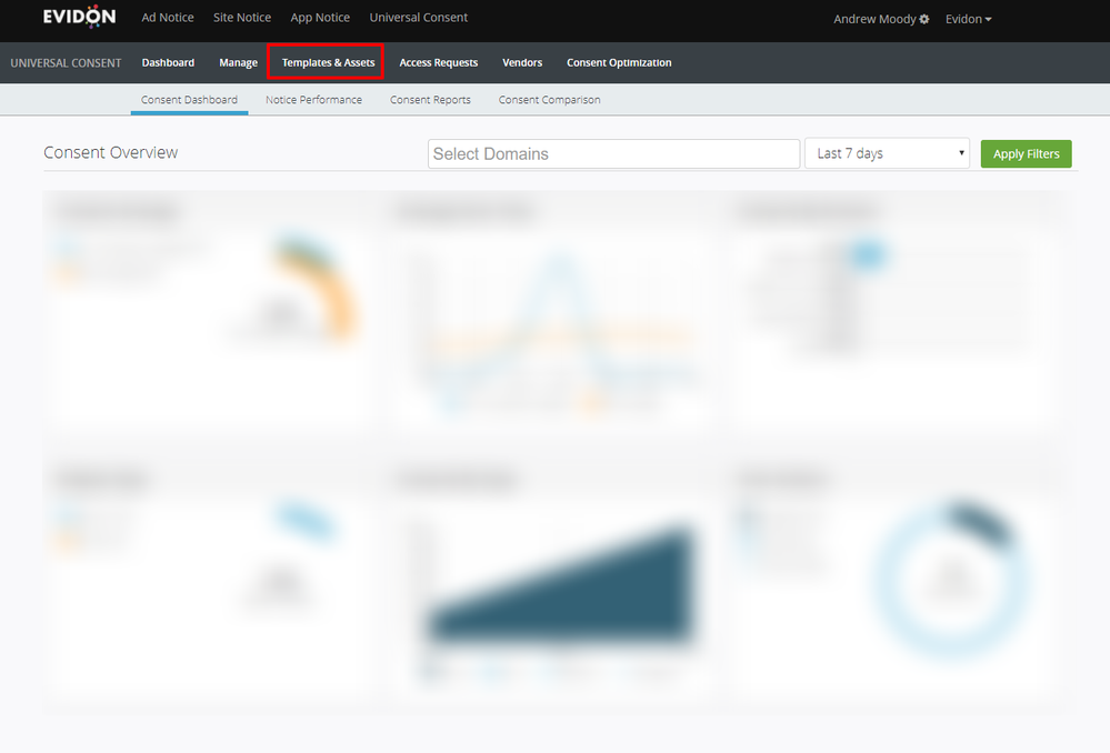
- From your UCP instance click on “Templates & Assets”.

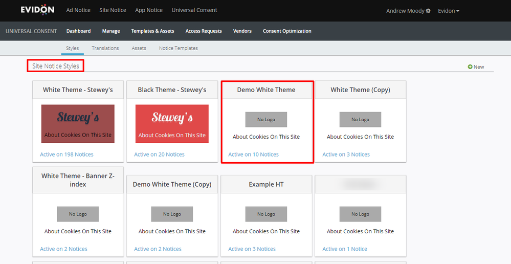
- Select the “Site Notice Style” you wish to edit.

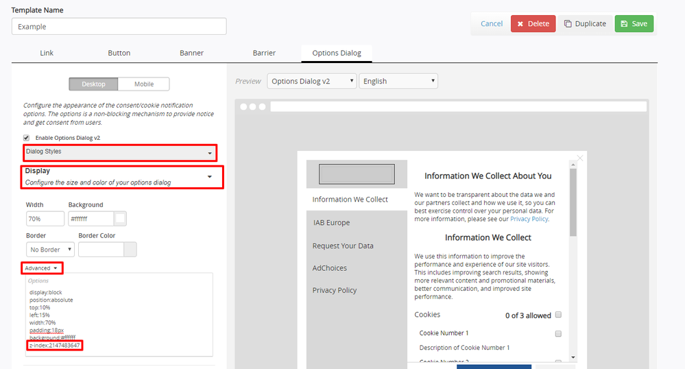
- Select “Options Dialog” from the tab. To see the preview for that section, select “Options Dialog V2” from the dropdown below that tab. Please ensure that you have the box next to “Enable Options Dialog V2” selected or your theme preview will show the original Options Dialog.
With that, you will be in the proper area to edit your Options Dialog V2 and you will be able to see a general preview. Please note that the preview may not look exactly as shown when you put the notice on the page due to some tool updates as well as CSS that may be inherited from the CSS on your page. Some testing on a pre-prod environment to get the look and feel exactly right is highly encouraged.
Common CSS Questions/Tips To Correct
“Elements on our page cover the notice, it does not sit on top of the content of the page completely.”
This is something reported somewhat frequently and is tied to the z-index of the elements already on the page. The UCP Options Dialog V2 has a default z-index of 0. This means that any elements on the page with a higher z-index than 0 will show on top of the Options Dialog V2 itself rather than the Dialog sitting on top of all the other elements on the page. To correct this, you will need to change the z-index of the “Display” of the Options Dialog V2, as well as the “Page Overlay” if you are using one.
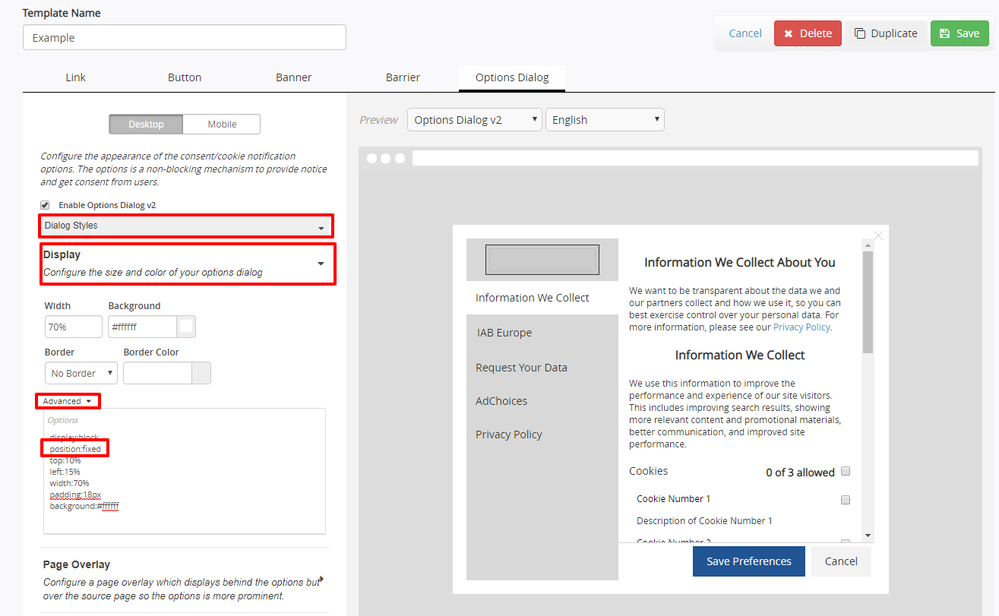
- From the “Options Dialog” section (we discussed how to get here in the section above), please make sure you are on the “Dialog Styles” section and then click on “Display” to expand it. Once that has been expanded, click on “Advanced” to open the advanced CSS section. Here you can add additional CSS outside of what is in the WYSIWYG section. Add a z-index of a value higher than any elements you wish to cover on your page. The highest allowed z-index in modern browsers is 2147483647 so if you wish to be sure you cover everything make that your z-index.

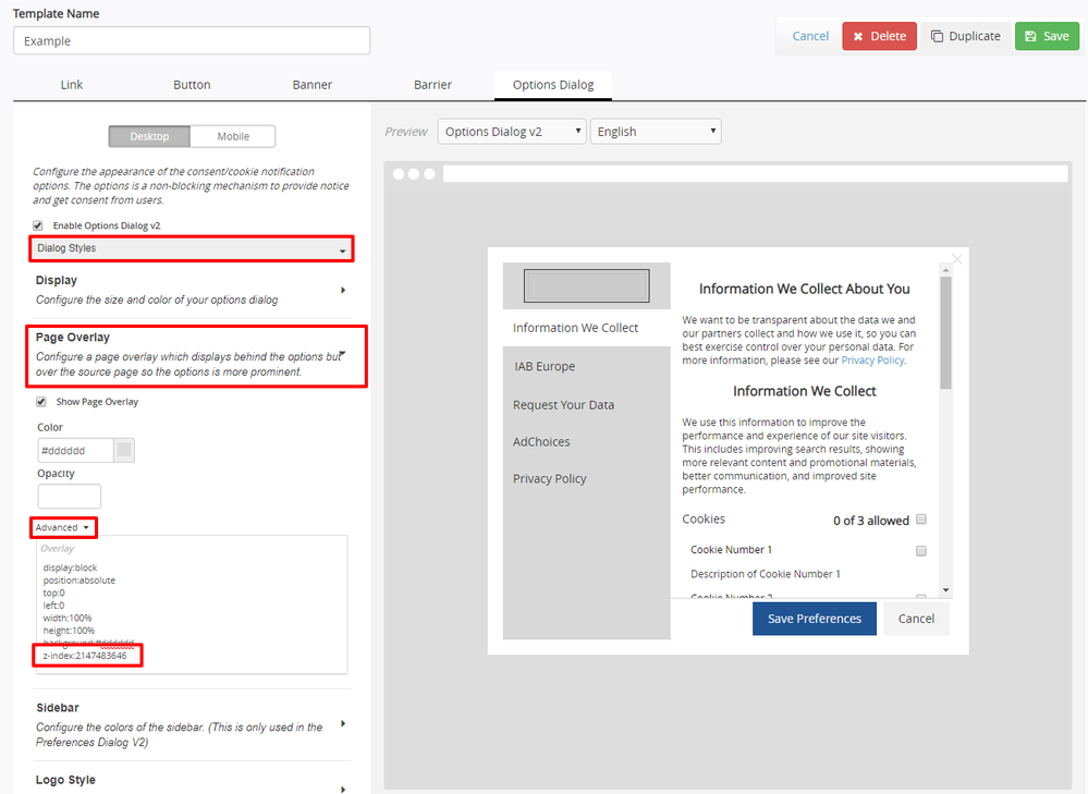
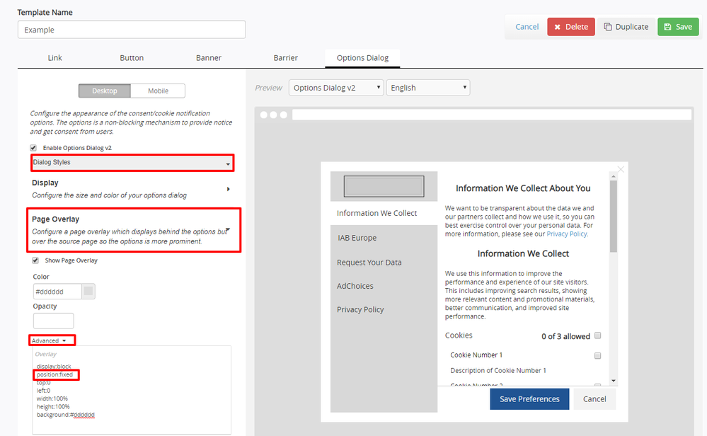
- We will need to do the same to the “Page Overlay” but with a slight difference to the z-index value (most use this, but if you choose not to you can ignore this section). Under “Dialog Styles”, click on “Page Overlay” to expand it. Once that has been expanded, click on “Advanced” to open the advanced CSS section. Here will add a z-index just as we did on the “Display” section. However, we will want to make sure the value is one number lower than the z-index we used for the “Display” so that it sits under the “Display” and not on top of it. So, for example, if you used the max z-index for the Display section (2147483647) you will want to make the z-index for the “Page Overlay” one value smaller (2147483646).

- Click the green “Save” button on the top of the page. When you navigate to your page again you should see the Options Dialog V2 sitting on top of all the content. Please note that you should clear your cache fully to see the change take hold.
“The Options Dialog only opens on the top of the page or does not scroll with the page as we scroll”
This is due to the default position of the Options Dialog being set to absolute. This is quickly corrected by changing the position of the “Display” and, if you utilize it, the “Page Overlay” to fixed.
- Please make sure you are on the “Dialog Styles” section and then click on “Display” to expand it. Once that has been expanded, click on “Advanced” to open the advanced CSS section. You will see that the position is set as position:absolute. Replace the absolute in the advanced section with the word “fixed”.

- We will need to do the same to the “Page Overlay” (most use this, but if you choose not to you can ignore this section). Under “Dialog Styles”, click on “Page Overlay” to expand it. Once that has been expanded, click on “Advanced” to open the advanced CSS section. You will see that the position is set as position:absolute. Replace the absolute in the advanced section with the word “fixed”.

- Click the green “Save” button on the top of the page. When you navigate to your page again you should see the Options Dialog V2 open on your page position whenever you open it. It should also scroll with the page as you scroll up and down it. Please note that you should clear your cache fully to see the change take hold.
“The toggle for the top category is offset”
This can sometimes happen when the CSS for the “All”category toggle and the toggle for the first category have something that causes them to collide with each other. There are two simple methods to correct this if you see it on your Options Dialog V2.
- Under “Text Styles” click on Category Header to expand it. Once that has been expanded, click on “Advanced” to open the advanced CSS section. In the “Advanced” section it is recommended you add two pieces of CSS. First would be to add clear:both. That will negate any collision with the toggles. This can still leave the toggles in a position where the “All” category toggle and the first category toggle sit directly on top of each other or even touch. To correct that you would want to add a line of CSS for top-margin and then the appropriate pixel value that gives you clearance you want. Generally, a number between 10-20px should allow for plenty of clearance without moving all the categories too far apart.

- Click the green “Save” button on the top of the page. When you navigate to your page again you should see the toggles not collide and have a bit of space between them. You may need to experiment a few times with the pixel values to get the correct look you want. Please note that you should clear your cache fully to see the change take hold.
