Overview
Following this steps in this guide, you will create, configure and test an advanced component to use your drag and drop template.
If you have not already created a drag and drop template, please check this guide for instructions.
Create an Advanced Component
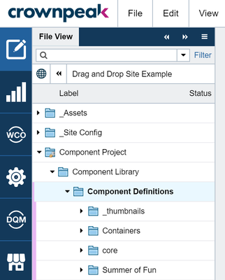
- Use the File View Panel to navigate to the /Component Project/Component Library/Component Definitions folder in your site. You should see a few folders there already.

- Select File > New > Model: Component Folder, enter a name and click Create.

- In your component folder, select File > New > Model: Component. Enter a name and click Create.
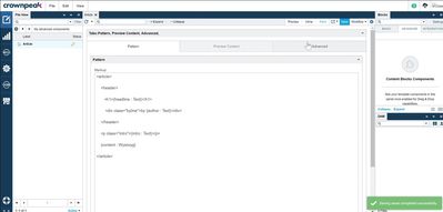
- Using the action bar, go to the Form view and Insert this HTML into the Markup field
<article>

    <header>

       <h1>{headline : Text}</h1>

        <div class="byline">by {author : Text}</div>

    </header>

    <p class="intro">{intro : Text}</p>

    {content : Wysiwyg}

</article>
- This HTML defines editable areas in your Markup as nested editable, components using the following syntax: {component name: component type}. Component types include Text, Wysiwyg, Image among others.
- Click the Save button to build your component.

Configure behavior of nested components
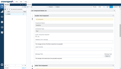
- Once saved, be sure you are still in Form editing mode in your new advanced component.

- Expand all the panels and scroll down to the bottom view the Component Details List
- Customize the behavior of each component
- Headline - Make this a required field
- Author- Make this a required field, change the label to 'Author Name and Location'
- Intro - Leave this as is. It will use the default configuration
- Content - Make this required, include a short message about what can be included in this WYSIWYG field
- Click the Save button to modify your component.
Define default content in your Advanced Component
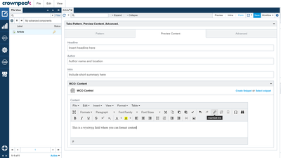
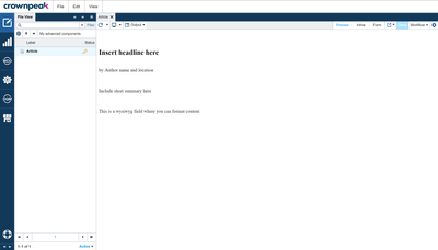
- Select the Preview Content tab.
- Enter content in each available field. This is the default content your users will see when they drag this component into a page.

- Click Save
- Click Preview from the Action bar to see your content in context of the new experience

Test!
- In the File View Panel, go back to your site root and open the test file you created using your drag and drop template.
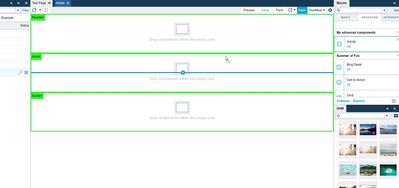
- Click the View menu and select the Editor workspace found under the Arrange Workspace submenu. This will place the Blocks Panel on the right side of the UI.
- Select Inline editing mode to see Content blocks
- Click on the Advanced tab in the Blocks Panel
- Find your new component and drag it into the page

Troubleshooting
- If your component does not show up in the Advanced content block panel , it's in the wrong folder. Be sure it's not in the models folder or different site root
