Handling High Resolution Images with FirstSpirit
- Subscribe to RSS Feed
- Mark as New
- Mark as Read
- Bookmark
- Subscribe
- Printer Friendly Page
- Report Inappropriate Content
After a tremendous growth of mobile internet access in the recent years, most web projects nowadays have to cope with mobilizing their content in one or another way. There are numerous approaches of dealing with different devices and screen sizes. As FirstSpirit is totally open towards output markup and formats, any state-of-the-art code can be managed and generated by FirstSpirit.
One specific problem developers have to face is bringing high-resolution images to the end-users’ devices. This article is about the specific challenges of handling high-definition images from FirstSpirit.
From low to high definition

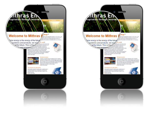
Individual pixels on such displays become indistinguishable, resulting in a much “crispier”, high-quality look. In order to make use of the HD-capacity, web developers have to adapt their code accordingly.
Style vs. physics
At first, some words on the technical background. On a traditional (i.e. low definition) display, one pixel in the CSS definition corresponds to one physical pixel on the device. On a display with 95 DPI, a website of 1000px width takes about 27 cm (10.5 in) on the screen – from the everyday experience, a good, readable scale.
On an 3rd generation iPad (264 PPI), 1000 physical pixels are just 9,6 cm (3.8 in) in size. If a website was simply shrunk to this ratio, it would be way too small to use. To avoid this, manufacturers have agreed to make one CSS pixel correspond to four (or more) physical pixels on HD-devices:
With this technical compromise, “normal” websites remain usable on HD devices. Unfortunately, images are by default also scaled up so that there’s nothing crispy about them anymore. So how can a web developer make use of the full physical resolution?
What’s relevant and what’s not
Up-to-date browsers handle a lot of HD-related issues natively. In general, everything that is defined by vectors will be perfectly sharp on a HD device without any code adaption:
- Fonts (standard, web and icon fonts)
- Style elements from CSS
- SVG images
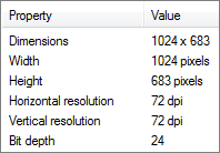
So how to deal with images on the website and graphical elements from CSS? A common assumption is that the output on the screen is related to the image resolution, as web graphics come with a standard resolution of 72 DPI (for example in the image properties on the right). In fact, this meta-data is ignored by all web browsers. (This looks different when dealing with print publications.) No matter what the DPI-number says: All that counts is the total number of pixels in an image. In other words: You don’t need images with higher resolutions – you need larger images.
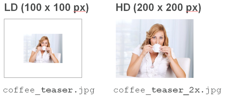
In the following examples, a device with a pixel-ratio of 2:1 (i.e. two physical pixels per CSS pixel in both dimensions) should output an image in the size of 100x100px as specified in CSS. To make use the full display capacity, the image needs to be 200x200px, thus holding 4 times the number of pixels.
A basic solution: HD for everyone!
A HTML-markup for this task is quite simple:
<img src="$CMS_REF(media:"image_200x200")$" width="100" height="100">
The image is always loaded in HD-resolution and is scaled to the desired output size using width and height-attributes.
Advantages | Disadvantages |
Very simple, rock-solid and browser-proof | 300% overhead on LD-devices |
When using zoom on LD-devices, images don’t blur until 200% | On LD-devices, browser scales image down with potential quality loss |
The huge disadvantage here is the massive overhead on LD-devices as HD images (with roughly four times the data load) are loaded regardless of the device’s capacity. Especially in the context of mobile websites this is hardly acceptable, as volume is critical in regards of load times.
Better: Multiple files and a query
A more sophisticated approach is providing individual image files specific to the device resolution. Apple has proposed a standard where corresponding LD/HD image files are distinguished by using a modifier like <filename>@2x.<fileending> for the HD-file. However, the modifier is not natively interpreted by any standard browser – there is no magic trick about the “@” in the filename. (This is a different story when developing iOS-applications). Nevertheless, it makes a lot of sense to use some kind of naming conventions for resolutions. With the FirstSpirit on-board image management, it’s possible to link LD and HD-images by setting up corresponding resolutions using a name (e.g. “teaser”) for LD and the same name plus a modifier (e.g. “teaser_2x”) for a matching HD-resolution. FirstSpirit will generate filenames like this:
With a modifier as in the example, both resolutions are handled without any additional FirstSpirit programming. However, if you absolutely have to use a special character like “@” in the image file name, you can achieve this with a relatively low effort through a custom URL-creator.
Once we’ve got the corresponding images, we need a switch deciding which image is delivered for the specific device. With CSS3, this can be achieved through Media Queries in the style sheets.
As there is currently no overall standard for addressing HD-devices, a CSS rule for the most common browsers could look like this:
@media
only screen and (-webkit-min-device-pixel-ratio: 2),
only screen and ( min--moz-device-pixel-ratio: 2),
only screen and ( -o-min-device-pixel-ratio: 2/1),
only screen and ( min-device-pixel-ratio: 2),
only screen and ( min-resolution: 192dpi),
only screen and ( min-resolution: 2dppx) {
/* HD-specific rules here */
}
Let JavaScript do the job
Combined with JavaScript, it is possible to detect the device resolution first and then load the appropriate image. If you don’t feel like writing and testing the code yourself, you might want to use one of the many free libraries like retina.js. In your FirstSpirit-markup, the HTML code could look like the following:
<script src="$CMS_REF(media:"retinajs")$"></script>
<img src="$CMS_REF(image, res:"image")$">
<!-- HD: $CMS_REF(image, res:"image_2x"))$ -->
When a page with this markup and script loads in a browser, the image is initially loaded in LD. If the device is capable of a higher resolution, the script checks whether a file with the same name and the pre-defined modifier is available. If this is the case, the HD-version is loaded and the JS adds width and height attributes to the DOM. Please note that line 3 in the above script (HTML comment) is not a necessary part of the script! It’s just a simple trick to make FirstSpirit generate both LD and HD resolution of the same image. If you do not want the HTML comment in your front-end markup, you could use a FirstSpirit script to deploy those images in an “invisible” way.
Advantages | Disadvantages |
Very easy to implement | LD and HD images require fixed suffix |
Just 1 JavaScript, no library | On HD-devices, 3 http requests per picture |
Overall low overhead | Will not work in FirstSpirit preview as FirstSpirit uses internal file names for preview and WebEdit |
Image initially loads in LD, then “sharpens up” |
More code, more control
If you need a higher level of control over your frontend HTML, you can do so by specifying image files individually for different resolutions. This can e.g. be achieved by using a script (such as the popular jQuery-plugin jQuery-Retina) and a custom "data"-attribute in your markup. In FirstSpirit, the HTML output channel could look like this:
<script src="http://code.jquery.com/jquery.js"></script>
<script src="$CMS_REF(media:"jquery-retina")$"></script>
<script>
jQuery(document).ready(function($) {$('img').retina();
});
</script><img src="$CMS_REF(image, res:"image")$" data-retina="$CMS_REF(image, res:"image_2x")$" width="100"/>
Here the JavaScript instantly loads the appropriate picture depending on the device. In this case, the reference to the retina-resolution image is taken from the “data-retina” attribute. If necessary, LD and HD-resolutions could also be handled within separate input components, if your project requirements were that specific.
Advantages | Disadvantages |
Very flexible | Needs jQuery |
Low overhead | Comparably complex |
Potentially invalid HTML |
If all these solutions seem like sneaky workarounds: They are. To solve the trouble with different display resolutions for once and all, an “official” extension is likely to come out with HTML 5. Discussions may finally result in a new “srcset”-attribute for the <IMG>-tag or an entirely new <PICTURE>-tag. Whatever the approach will be, it will make browsers deal natively with different resolutions without any scripting or overhead.
What about cropping?
From a FirstSpirit-standpoint, one issue remains to be solved: What about cropped images? If an editor uses FirstSpirit to crop a square teaser picture from an image, FirstSpirit will natively only crop the selected resolution, not any corresponding other one. Obviously, no editor would want to perform multiple manual crops on the same image. In most implementations, this is done through a script as part of a custom workflow on image elements. Let’s assume an editor has manually cropped an image in the HD resolution. During the release process, a script manipulates the image like this:
- Check if the image was cropped manually
- Load HD-picture inputstream from repository
- Scale picture to 50% (or others, if not 2:1)
- Write new picture to designated LD resolution
- Release medium
Attached to this post you find a demo project (FS Version 5.0.318) where an automated cropping can be triggered from the context menu of pictures in the mediastore. Simply crop an image in one of the HD resolutions, unlock the image, start the script by right-clicking the element and choosing "Execute Script -> Scale Lower Resolutions". The source code of the script is also attached to this post. Feel free to use it in your own projects, but be aware that this is a demo implementation only and might need some additional tweaking to run smoothly in your productive environment.
tl;dr
FirstSpirit can deal with high-resolution images perfectly fine. As a project architect, you need nothing but the following:
- Set up corresponding LD and HD resolutions in FirstSpirit using a modifier like “_2x”
- Use an out-of-the-box script to deal with Media Queries and the JavaScript
- Deploy a workflow script to automatically deal with cropping
You must be a registered user to add a comment. If you've already registered, sign in. Otherwise, register and sign in.


