DQM New UI - June 2023
DQM has received a major facelift featuring an accessible, modern, easier-to-read interface.
Our vision for DQM
- To be the simplest and easiest to use Quality Management Platform
- To enable organizations to manage Digital Quality
- To be the most comprehensive Quality Management Platform
- To be the best Experience Optimization Platform
What's new
Login screen

- New login screen - includes a right-side panel for messaging (what’s new in DQM, new features, how to get help, etc.)
- Log out message - upon log out, you now see messaging that you’ve logged out.
- Timeout messages - when logged in, a timeout message appears when there is inactivity for 28 minutes, notifying you that your session is about to end. You’ll see a two-minute countdown, where you can choose to continue working or log out. If you do nothing during this time, DQM will automatically log you out.
- High contrast messaging and icons - now included on the login screen and throughout the application.
Navigation

- New left navigation menu - this menu is now easier to read and navigate from the left side. The menu is keyboard accessible and contains collapsible and expandable sub-menus. You can also close the entire navigation to increase screen space.
- Icons and labels - now included everywhere in the UI.
- "Skip to content" option in top left - this option is available so that users who don't use a mouse don't have to go through the entire navigation every time as s sighted user would do. You can use the keyboard and Tab key to activate the Skip to content option, which will be the first in the focus order.
- Remembers last context - DQM now remembers the last context you were in and takes you there upon the next login. (Previously, you had to select your environment upon login each time.)
- Help menu - this menu includes the following:
- Checkpoint library
- Community
- Learning platform - educational videos
- Username - in addition to your profile, settings and logout options, this menu includes a link to return to the classic DQM.
Page Checker

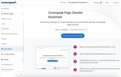
The Page Checker is now located in the left navigation menu. The landing page has overview information and instructions on how to use Page Checker.
If you have an account with multiple dashboards, you can now select a dashboard from the drop-down and install the checker to each dashboard.
Contrast Checker

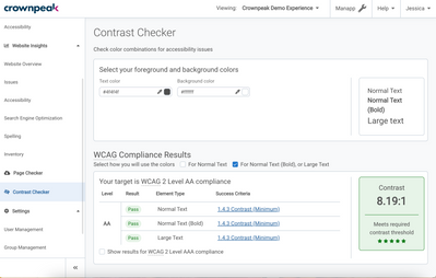
The Contrast Checker tool is a new tool for developers and designers to test their color schemes to ensure accessibility.
Note: This tool is not automated or an analyzer.
Spelling

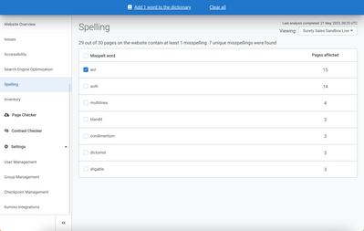
This tool checks the spelling on your websites by word, and no longer by page. You can now add words to the dictionary by selecting the word using the checkbox. From the dialog, you can determine which words to add to the dictionary.
Checkpoint Management

You can now view Priority only checkpoints, and filter by Quality topic. Admins can also add context to a checkpoint instead of reaching out to Support. A Reset link is also available in case you need to reset a checkpoint description back to its default information.
Manual Services
Crownpeak now provides manual services for an accessibility audit, or DQM prioritization to website remediation.
Data migration
All data is migrated over to the new UI, including credentials.
Accessing the DQM new UI
Moving forward, you can access the new DQM UI here: dqm.crownpeak.com
Use the following link to access classic DQM: classic.dqm.crownpeak.com
Note: Classic DQM is still accessible from the user profile drop-down for a limited time.
Reporting
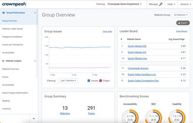
- Color-coding - color-coding red, yellow, green icons appear on reports for easier prioritization.
- Icons - icons included where appropriate on reports. Example: Website Overview page
- Website Leader Board changes - added the following columns: Accessibility, SEO, Usability. DQM classic only had theses 4 columns: Avg Issues/Page, Pages, Issues, Priority. These changes replace the Group Benchmarking report.
Accessibility
- Everywhere there is a time series/chart, you can view the basic data by clicking the View data link.
- When viewing checkpoints, a drawer opens instead of a new tab to prevent multiple tabs from being opened. Breadcrumbs are also included for easier navigation.
- If a manual test is required, classic DQM denotes with a hand icon. Now you’ll see “Manual Test Required” in text form.
- Explanations of abbreviations/acronyms in-app are present.
- Everything is accessible via keyboard for those don't use a mouse.
What's missing
The following items were decommissioned or re-envisioned in the new DQM UI:
- Download Center - not in new UI. Instead, we included an Export button everywhere in the UI to download the respective report and be closer to the date.
- Issues - We removed the Checkpoint Query functionality.
- Group Leader Board - You can now view by Group from the Website Group drop-down in the Website Leader Board report.