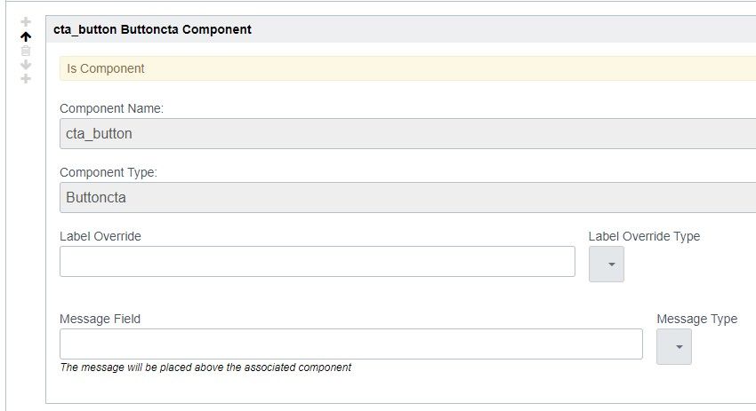
Below the Pattern Markup of a component, in the Component Details list, each subcomponent has a few "options" baked in, such as "Label Override" and "Message Field".
 Component details current example
These options should be expanded to allow for greater developer control:
- A field that would pass the value as a parameter to the ComponentInput, ComponentPostInput, and ComponentOutputmethods.
- Even better would be a special method or class we could use in ComponentInput(something like Input.StartComponentDetailsPanel()) that would let us create an entire custom expand panel.
- This would allow for further customizing the passing parameters using dropdowns, radio buttons, etc.
- These parameters and values could then be accessed like an asset DetailsPanel["button_options"]
- A third improvement would be to allow us to pass content from the parent component to the subcomponent, similar to passing props or state in React
- This could give us the option to create fully autonomous sub-components, that replicate content based on what the User has already entered.
- For example, if a user used an AcquireDocument input on a parent component, and we passed that information down, we could create independent subcomponents that created a link to this document, and another that showed the title, extension, and filesize as a toast.
- UX wise, you would use the component name (e.g. {heading}) as the parameter value
After this writeup, I am aware that some of these use cases are served with templates, however, I believe strongly in the modularity of components to be a better and more scalable solution.
ALSO, this WYSIWYG editor should support <code> tags